Kirshenbaum
In an effort to refresh their brand, KBS brought me on as Brand Design Director to explore how the agency's identity could evolve to better differentiate itself from traditional advertising agencies.
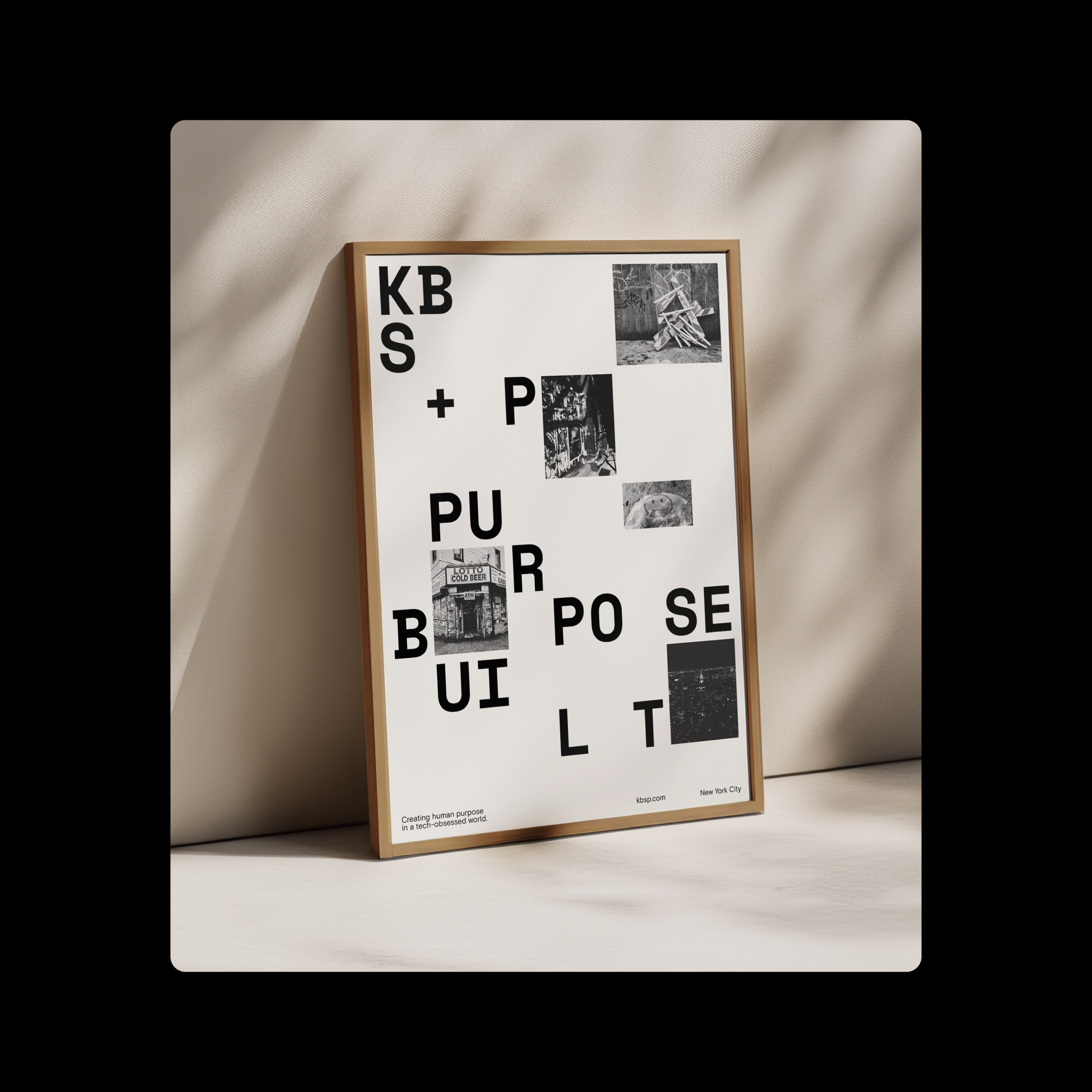
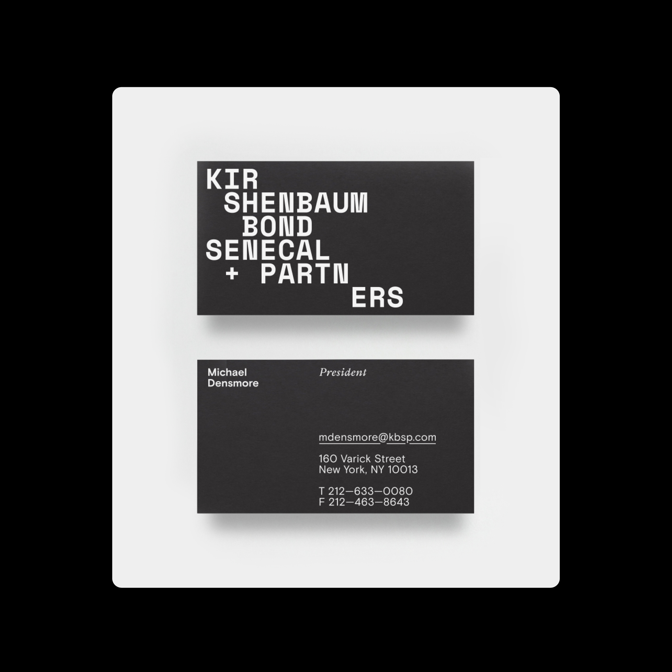
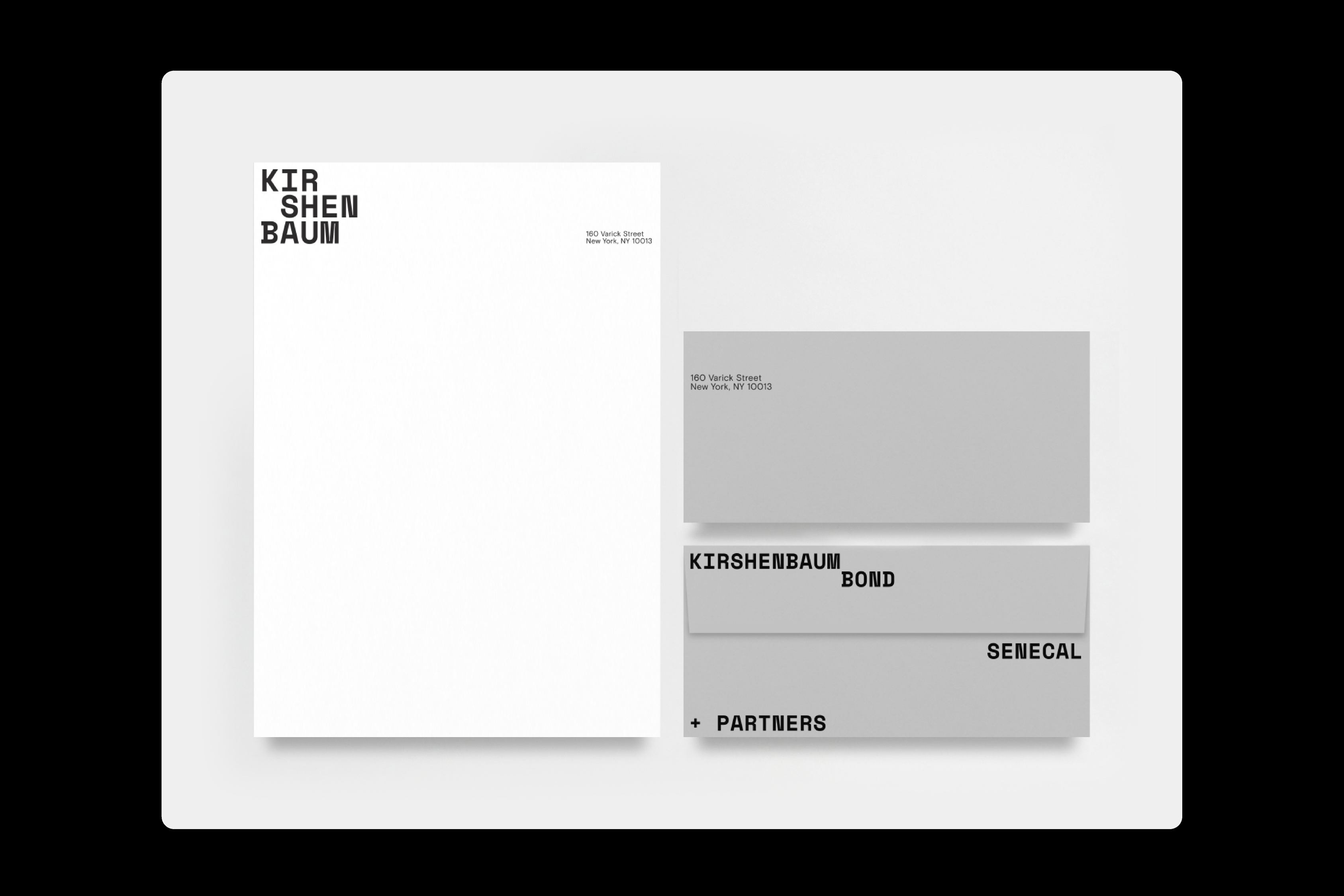
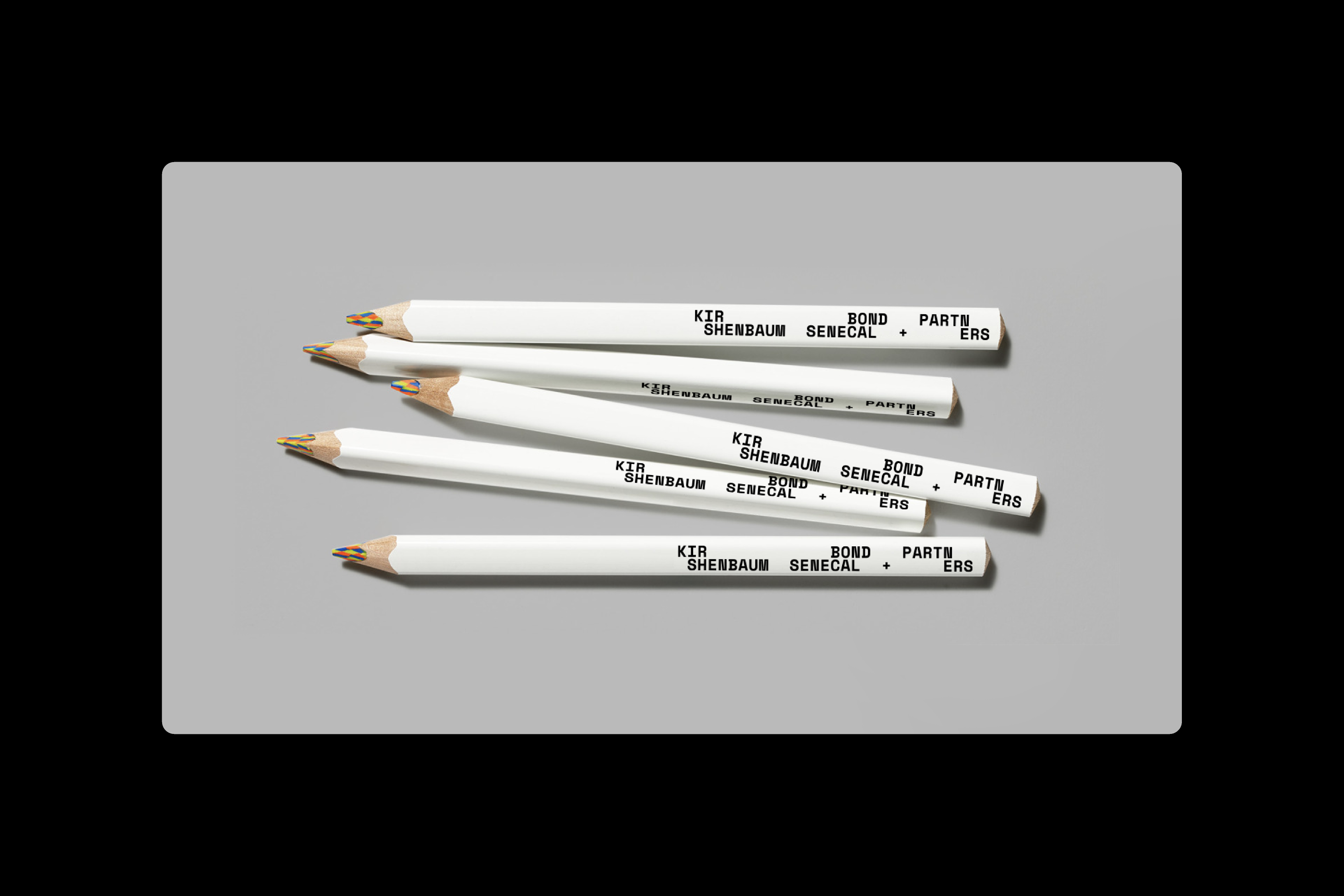
One of the visual systems that I proposed leveraged their full name (Kirshenbaum Bond Senecal + Partners) instead of "KBS" to create a dynamic and flexible typographic identity. Utilizing a Google font as it's primary visual element, playful, grid-based character arrangements allow for endless logo permutations and unique compositions.
Ultimately we moved forward with a different direction that was much closer to their existing identity at the time, but I've always liked this approach.
Brand design for KBS in New York. Creative direction by Matt Saint-Gelais.